At Paskill, we research and build a lot of higher ed websites. That makes it hard to impress us. But when we find a good college website, we take note.
There are a lot of ways higher ed sites can stand out from the pack. Maybe it’s incredible visuals, compelling storytelling or near-perfect UX. The better a site looks and functions, the more likely it is to achieve its goal: turning users into prospects and prospects into enrolled students.
Need some examples of a great higher ed website experience? Here are a few university sites we look to for inspiration.
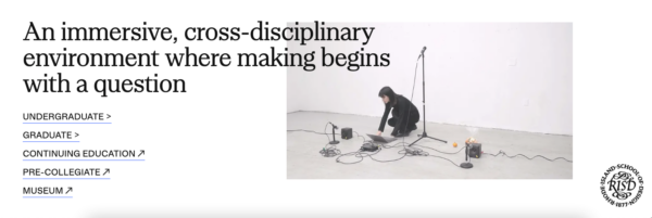
Rhode Island School of Design
This is a college who really understands its audience. From their tone of voice to the imagery they feature throughout the site, RISD’s content speaks directly to their perfect prospect.
Brown University
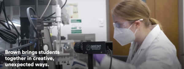
Never underestimate the power of above-the-fold content. Brown’s use of video right at the top of the page is attention-grabbing and immediately shows the impact of the work the university is doing.
Stanford University
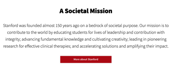
Stanford puts storytelling front and center. Their site uses compelling visuals and multiple perspectives to establish a brand narrative — and then backs it up with events, metrics and outcomes.
Virginia Commonwealth University
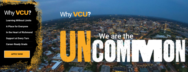
You’ll never forget the VCU brand. They carry their brand throughout the entire site, using high-quality visuals and clear, to-the-point information to tell their story.
Kenyon College
Looks may not be everything, but you can’t deny that Kenyon’s website is beautifully designed. Even better, it’s easy to use and knows how to talk to each of its specific audiences.

MIT
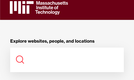
Is it a surprise that MIT is living in the future? Their website puts search front and center, showing that they know what users want (and where the future of websites is heading).
Wheaton College
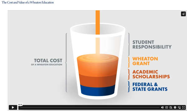
Many colleges shy away from talking money, but let’s be real: Prospects want to know how much their education is going to cost. Wheaton is transparent about their tuition costs while touting their financial aid resources. The video they’ve made explaining the value of a Wheaton education is also a nice touch.
Cal Poly Humboldt
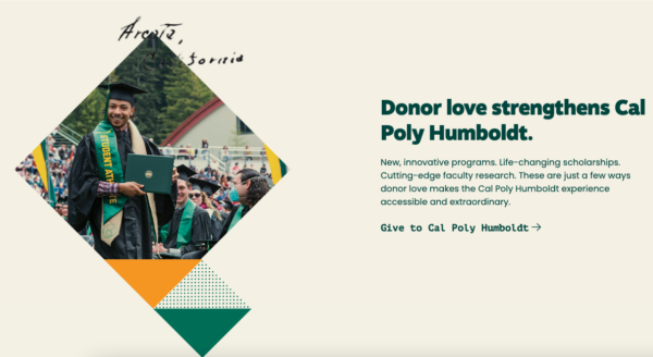
Cal Poly Humboldt isn’t afraid to break the mold. Their design is bold and stands out from other higher ed websites, and their condensed navigation makes the site easy to navigate.
Dartmouth College
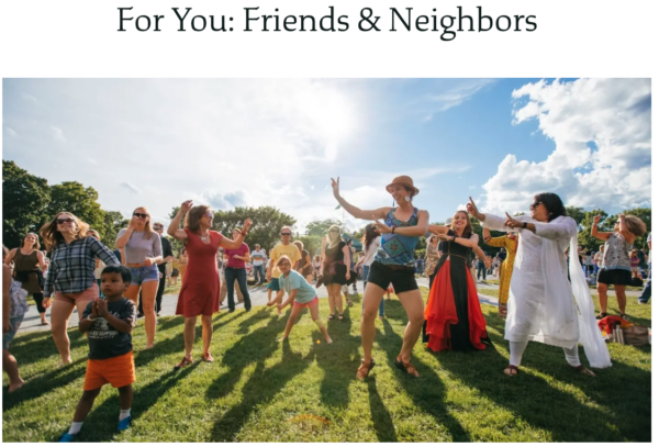
Dartmouth took Mr. Rogers’ lessons about being a good neighbor to heart. Their “Friends & Neighbors” page speaks directly to this often-overlooked audience, advertising all the events and facilities available to the community. It’s also a great, subtle way to promote their adult learning offerings.
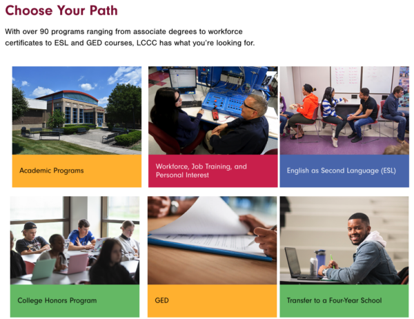
Lehigh Carbon Community College
If you’ve got it, flaunt it. LCCC has a bold color palette they aren’t afraid to use throughout their site. The result? Eye-catching page designs that don’t look like your typical college website offering.
Paskill has launched 50 website projects in the past five years, with several enterprise sites winning gold in the Educational Advertising Awards, including Genessee Community College, Three Rivers College, The College of St. Scholastica, and Kansas Wesleyan University. Learn more about our approach to higher ed website solutions.


