If you’re considering a new institutional website, the decisions you make now will likely please you or haunt you for years to come.
That’s because your website is one of the most important enrollment marketing tools in your arsenal. It’s your digital front door. And while it serves many audiences, including current students, alumni, and employees, the two that must be foremost in mind are prospective students and their families. Every decision you make regarding your website should be made through a marketing lens with those two audiences in your sights.
We have launched more than 50 higher ed websites over the past five years. That experience has taught us a few key lessons to keep in mind regarding content preparedness and management as you embark on your rebuild.
Never forget your website’s purpose: enrollment marketing
Let this be your ultimate litmus test: When considering concepts and content, ask yourself, “Is this advancing enrollment? Is this helping a prospective student or family learn more about the institution?” If the answer is no, it’s not right for the site. It will only create clutter and make it harder for search engines to get prospects to the page they are looking for.
Make it easy for the user to find what they are looking for
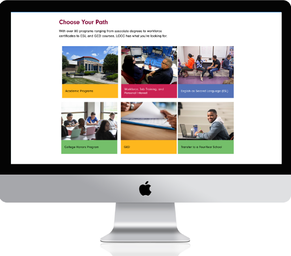
Yes, your institution is unique and, yes, you have to convey that. But balance your institutional uniqueness with what your audience needs: information and the ability to navigate easily and intuitively. Here’s an example: Potential enrollees are looking at other institutional websites, too. Often, they’re trying to compare apples to apples. If you don’t have top tabs that say Admissions and Financial Aid, you’ve lost that prospect.
Create specific content governance guidelines
The content on your website must reflect a unified voice. Make sure the people writing content in your content management system or submitting it for inclusion on the website have guidelines to follow. The goal is a consistent, quality user experience. Having different voices on different pages is disorienting and undermines the brand.
Clarify upfront what will be included … and what won’t
Certainly, you want everyone to have a voice in the project, but, again, make sure all stakeholders understand why certain things will be included while others will not. The final determinant should be, “Does it serve the purpose of enrollment marketing?” This requires establishing a point of view upfront and educating all your constituents why certain decisions are made—specifically what goes on the site and what goes in the student portal.
Appoint a team of content gatekeepers
Make your team large enough to avoid bottlenecks and small enough to be efficient. Have all members lead from the same strong governance plan. That plan should ensure the tone of voice is on-brand, the content is driving toward the goal of enrollment, and that it meets accessibility standards. This also applies to the look and user experience of your site. Are authors uploading photos? If so, are they adding appropriate alt text to those photos? Are they picking colors that not only comply with your brand standards, but with accessibility standards, as well?
Keep language universal—not university
Prospects are hungry for information. They’re often looking for specific programs. Make it easy to find and understand your program offering by using common, universal terms. Also, make sure program descriptions are marketing-oriented. Use informative descriptions to whet the appetite and consider augmenting content with student testimonials or video of professors in action.
Develop a site as unique as your institution
Your website should be as unique as your institution. It should reflect who you are, what you stand for, and all the things that contribute to your singular student experience—all while making sure key information is easy to find in expected places.
So why not partner with a company that actually creates custom websites, each tailor-made for the individual institution? At Paskill, we see you as a unique entity. We spend time with you, getting to know you, your team, your market, and your competition. That process of discovery leads to a strategy based on your specific situation and our expertise in identifying and crafting unique selling propositions. Then we work with your stakeholders—including your IT team—to make sure they are comfortable with our recommended approach.
One more consideration: A new institutional website will take anywhere from eight months to a year or longer. You might as well do it with a partner you like and trust, one who will be standing with you years down the road. Paskill has been serving the higher ed market for nearly 40 years. We’re ready to help you create the perfect centerpiece for your enrollment marketing.


