Redesigns start with on-site research
When Lehigh Carbon Community College (LCCC) partnered with Paskill to redesign their website to focus more on the prospective student experience, we decided to start our research by going right to the source. To truly understand LCCC’s culture, we conducted nine on-campus discovery sessions with faculty, staff, and students. We heard firsthand what was and wasn’t working on the site, learned more about LCCC’s web needs, and talked directly to students about how to improve the admissions process.
Using these learnings, plus findings from a site crawl and technical analysis, we figured out a plan to make LCCC’s site more user friendly to prospects.
Cleaning up the site map
LCCC had a complex navigation system. It was organized around internal structures instead of being designed with prospects in mind. Internal jargon, repeat pages, and the occasional sidebar navigation made it difficult for users to find the information they needed.
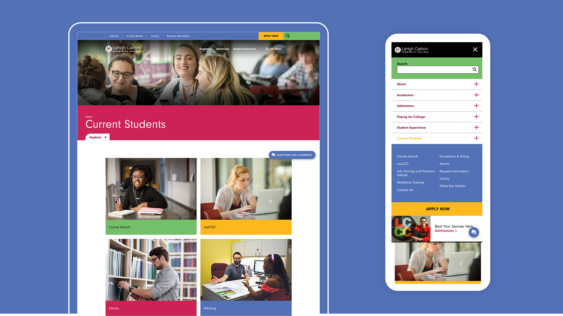
To create a more user-informed navigation, we paired down the site map to remove repeat pages, grouped similar content, and renamed pages that used internal verbiage or jargon.
LCCC has a diverse student body and community and wanted to make the site accessible to all. While a site translation feature did exist on the original site, it didn’t meet all LCCC’s needs. It was also buried in the footer, making it harder for users to find. We suggested integrating a new translation tool into the site and moving it up to the utility navigation for easier access.
The final site map features a more streamlined, intuitive navigation that was better set up to help users accomplish their goals.
A new look for a new site
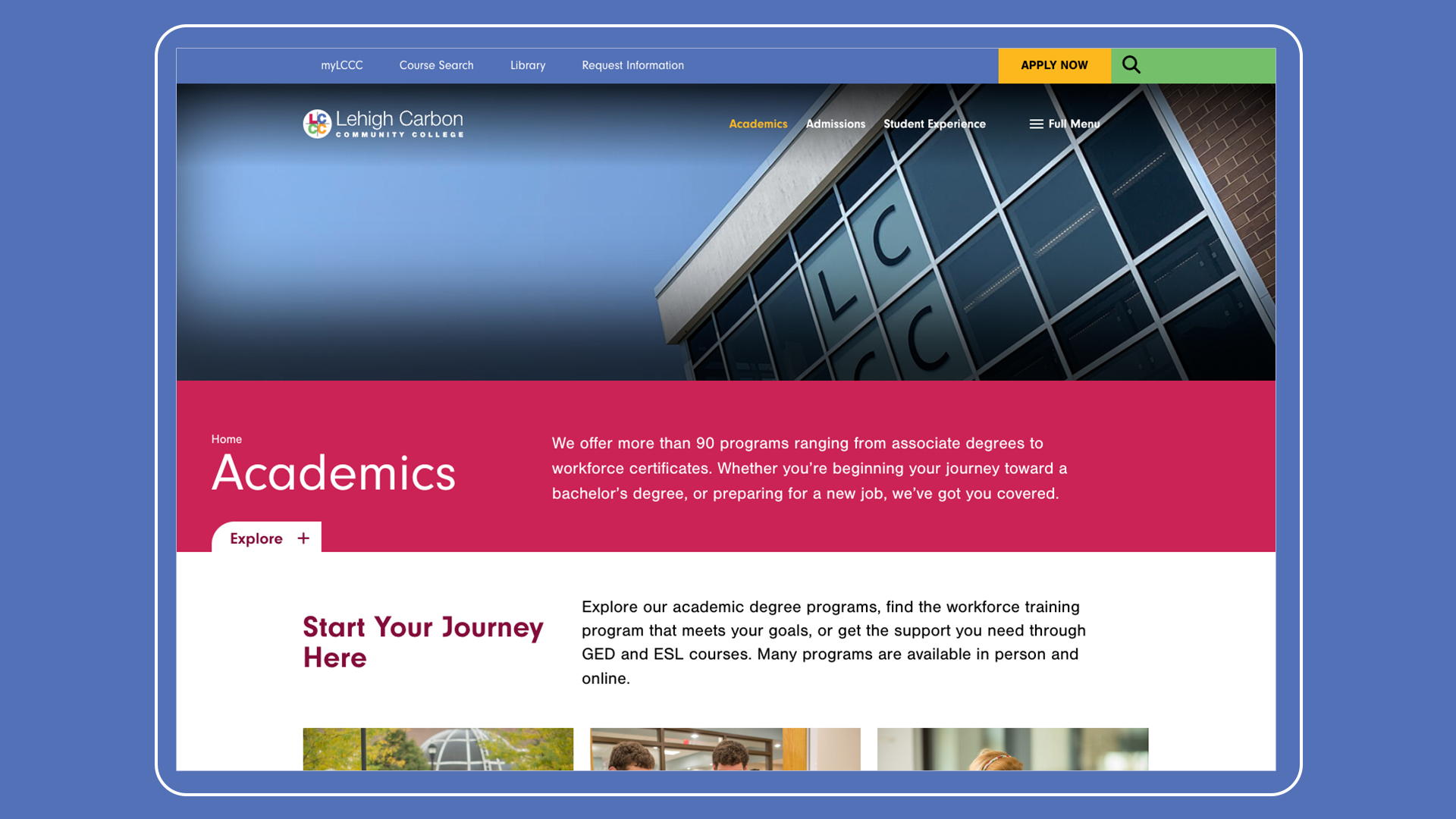
We established a cohesive, consistent user interface that matched LCCC’s brand identity. To reflect their diverse community, we also made sure photos showcased real students to better reflect LCCC’s brand and campus culture.
One thing you notice about the redesigned LCCC website? A bold new look. LCCC has a nontraditional color palette featuring magenta, green, yellow, and periwinkle. We used their fun primary and secondary colors to create an eye-catching look that stands out from a typical college website.
It wasn’t just prospects who took notice. LCCC’s redesign earned a 2024 Educational Advertising Award.
More from the Paskill team
We’re always thinking about the next big thing in higher ed marketing. Here’s the latest from our team of experts.


